Fjord & Grain Bakery
Fjord & Grain is an artisan bakery opening in Copenhagen's city center baking entirely with organic, heritage_grain flour and long fermentation.

Fjord & Grain Bakery
Fjord & Grain Bakery
Role:
Brand system
Design strategy
Fjord & Grain is an artisan bakery opening in Copenhagen's city center baking entirely with organic, heritage_grain flour and long fermentation.
Challenge
Most brands that speak the language of nature end up looking the same: earthy palettes, hand_lettered scripts, a sprig of something. The challenge was to feel genuinely rooted in Nordic landscape, geological time, slow fermentation without borrowing the visual vocabulary everyone else is already using.
Strategy
The answer came from asking a different question: not what does a bakery look like, but what does patience look like? From that, everything followed. Nature offered a better symbol than the pantry: the snail, unhurried and geometrically perfect, carrying the golden ratio in its shell and the shape of a cinnamon roll in its spiral. The brand would be built on depth over decoration: every element needed to earn its place by meaning more than one thing at once. Texture would come from geology, not foliage. Type would be personal but precise.
Result
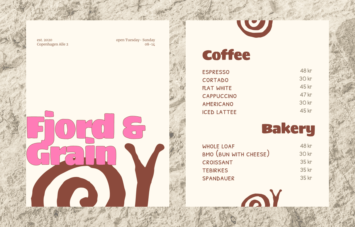
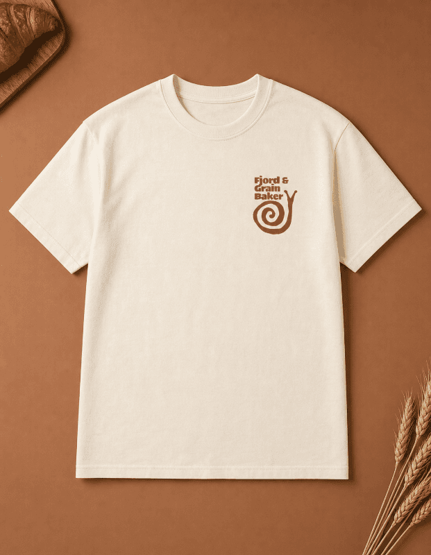
The identity centres on a hand-drawn snail rendered like a naturalist's field sketch, ink on paper. Texture lives in the packaging and brand system; the logo always breathes on clean ground
Challenge
Most brands that speak the language of nature end up looking the same: earthy palettes, hand_lettered scripts, a sprig of something. The challenge was to feel genuinely rooted in Nordic landscape, geological time, slow fermentation without borrowing the visual vocabulary everyone else is already using.
Strategy
The answer came from asking a different question: not what does a bakery look like, but what does patience look like? From that, everything followed. Nature offered a better symbol than the pantry: the snail, unhurried and geometrically perfect, carrying the golden ratio in its shell and the shape of a cinnamon roll in its spiral. The brand would be built on depth over decoration: every element needed to earn its place by meaning more than one thing at once. Texture would come from geology, not foliage. Type would be personal but precise.
Result
The identity centres on a hand-drawn snail rendered like a naturalist's field sketch, ink on paper. Texture lives in the packaging and brand system; the logo always breathes on clean ground


NEXT CASE
